
From Intimidation to Creation: My First Foray into Typography
How I finally tackled a creative fear, embraced the chaos, and found freedom in the process.

There are certain skills in the creative world that can feel like pure magic. For me, that magic has always been custom typography. I’ve spent countless hours admiring artists who seamlessly blend intricate illustrations with bold, expressive lettering. I could see how cool and creative it was, and yet, I was completely and utterly intimidated by it.
How do they decide? How do they take letters of different shapes and sizes and fit them together in a way that looks so... cohesive? The thought process was an enigma to me, a skill set I filed away under "unsolved mysteries" and "not for me."
But my love for typography designs never faded. So, I finally decided it was time to stop admiring from a distance and start learning. I enrolled in a Skillshare course by Vinitha Mammen called "Hand Lettering Practice: 3 Easy Steps to Explore New Typography Styles," hoping it could demystify the magic.
The "Aha!" Moment That Changed Everything
The course lived up to its name. The instructor did a phenomenal job of breaking down a seemingly complex process into the promised 3 easy steps: first proportions, then shapes, then details.
But the real, game-changing unlock for me was learning that nearly every letter can be structured within a simple 5x3 grid. This grid can be stretched or squashed, but as long as that core proportion remains, you can create an endless variety of legible letters that will fit together. It was the logic I had been missing. Suddenly, the magic had a system.
An Experiment in Chaos
Armed with this new framework, I gave myself a challenge. I decided to create a nine letter piece and I set one major rule: every single letter had to be different. A different proportion, a different shape, and a different design detail.
My goal was to explore, but my expectation was unadulterated chaos. I fully expected the final piece to be a hot mess of conflicting styles. With no cohesion between any two letters, how could it possibly look good? I leaned into the glorious chaos.
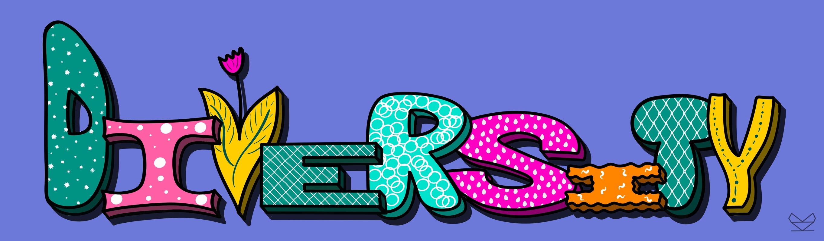
To my surprise, something kind of cool-looking emerged. Through all the intentional chaos, a strange sense of harmony appeared. It’s not a polished portfolio piece, but it’s proof of a process that works.
The Glorious, Messy, Truth
Of course, the process wasn’t without its struggles. Just ask the letter "E."
I initially styled it as a loose scribble, which I liked on its own. But as I started adding solid outlines and 3D effects to the other letters, the lonely scribble just looked off. I tried adding a solid color behind it, but I couldn't get the colors to work. I tried making the letter solid with the scribble on the inside, and that didn't work either.
In the end, I abandoned the scribble idea altogether, made the "E" a solid letter like the others, and added a new pattern. It was a moment of friction and failure, and if you watch the time-lapse video, you’ll see I spent more time struggling with that one letter than any other.
The Freedom of Being a Beginner
This project taught me a huge lesson: it's foolish to look at another artist's work and assume you could never master the skills to create something similar. My first real attempt at typography is a thousand times better than I ever imagined it could be, and full credit goes to the instructor, Vinitha Mammen. She made the topic incredibly accessible, and she's also an amazing artist in her own right—I highly recommend you check out her work on Instagram.
The creative journey is so much more fun when you're not afraid to step outside of your comfort zone. There is a real freedom in allowing yourself to be a beginner—no expectations of creating something great, just a belief that if you follow the process, the skills will come, and great art will eventually follow.
Now it's your turn!
When was the last time you truly embraced being a beginner? I'd love to hear about a course, teacher, or "aha!" moment that helped you unlock something new.